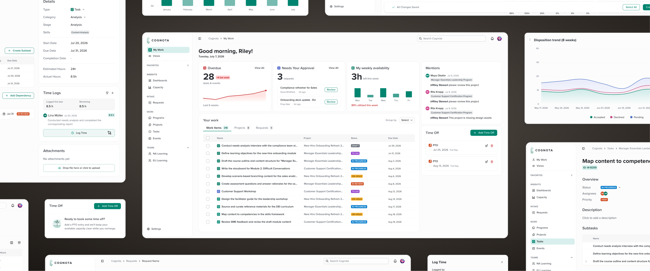
Cognota
Building Trust Through a Clearer NextGen Experience
The Problem
Cognota's 2025 churn analysis pointed to missing features, poor usability, and a lack of demonstrable ROI — signaling an opportunity to move the platform from a "nice to have" to a must-have as customers scaled their learning programs. Closing that gap aligned with Cognota's North Star: an enterprise-grade platform with native agentic capabilities that lets customers confidently plan, execute, and prove the impact of learning at scale.
The scope of change needed was large enough that Cognota decided to build a net-new platform, internally called NextGen, rather than continue iterating on the old one. NextGen entered Alpha testing in June 2026, where testers were satisfied with the breadth of functionality but consistently flagged two issues: the experience felt "functional" rather than "visually appealing," and the layout was unintuitive, requiring users to jump between different areas to complete tasks.
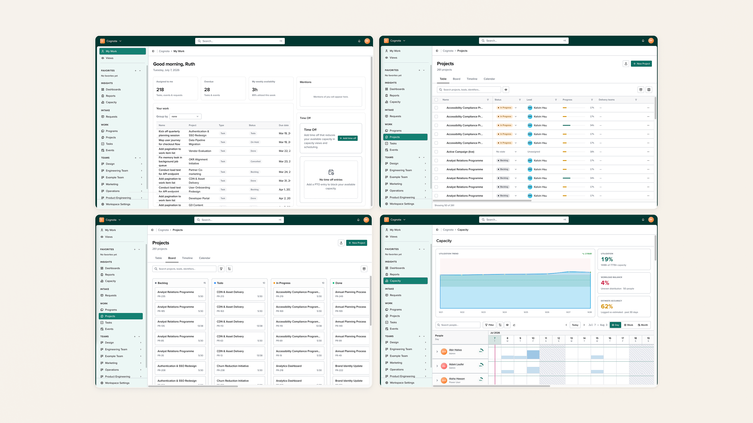
"It looks clunky and not aesthetically appealing..." — Cognota Power User and Alpha Tester
With the Alpha deadline top of mind, the NextGen team had focused primarily on functionality, leaving little time to invest in visual design. As my work on the existing product wound down, I was pulled in to audit and improve NextGen's overall experience, with a focus on elevating the visual design so it felt modern and polished.
Process
I owned the visual redesign end-to-end, running regular brainstorming sessions with the Lead Product Designer and incorporating feedback from both the Lead Product Designer and Head of Product throughout.
Using Claude Cowork, I researched the enterprise software market to identify products delivering an elevated experience in line with UI best practices, running UI teardowns on the products that came up most often and identifying recurring patterns among them. I also analyzed a few consumer-facing products for additional inspiration.
Then I audited NextGen's existing layout and functionality, drawing on years of accumulated user feedback, to find where the experience felt unintuitive. That included reviewing the home dashboard content to check that what we surfaced was actually useful to people.
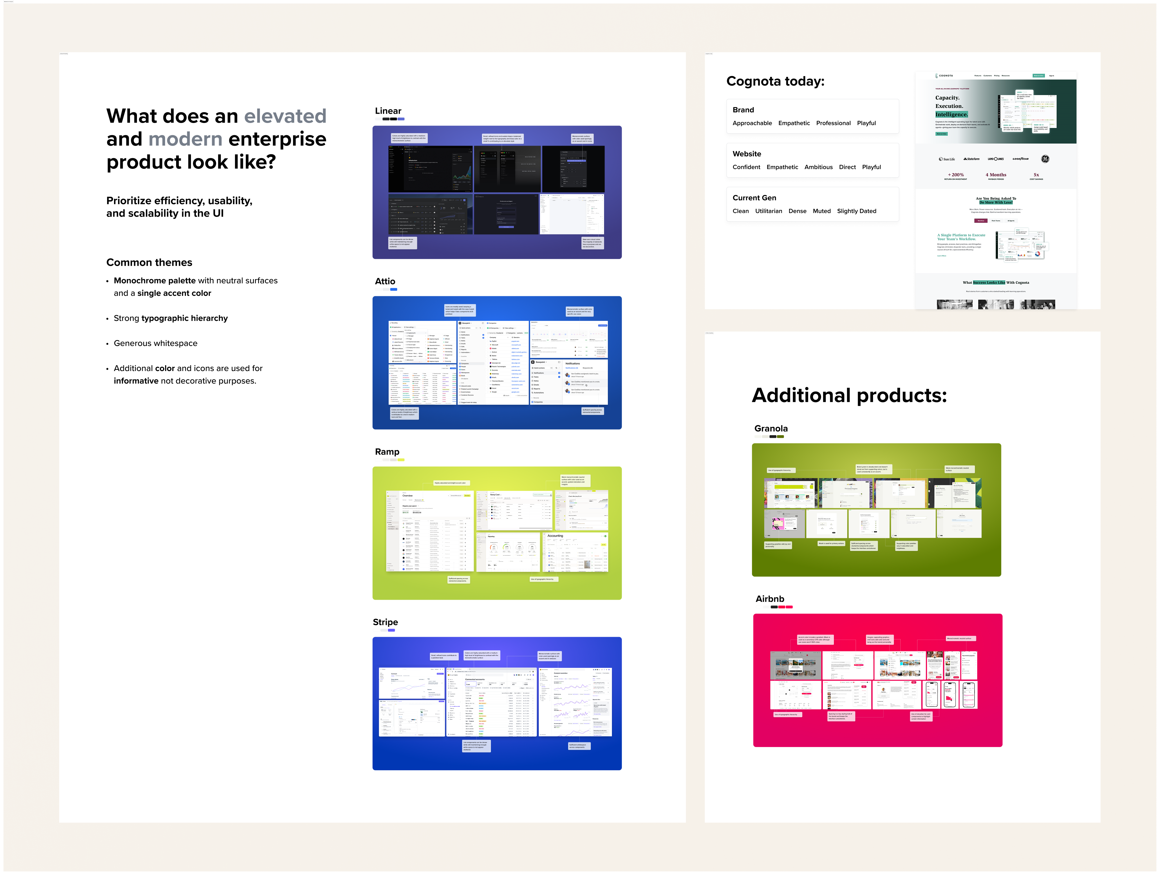
Based on these teardowns and my analysis of what wasn't working in NextGen, I proposed a direction built around clarity and consistency:
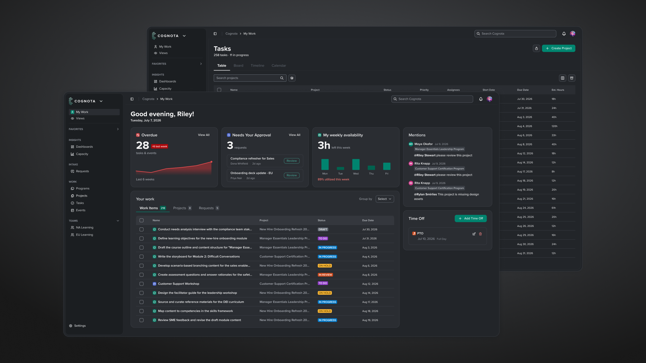
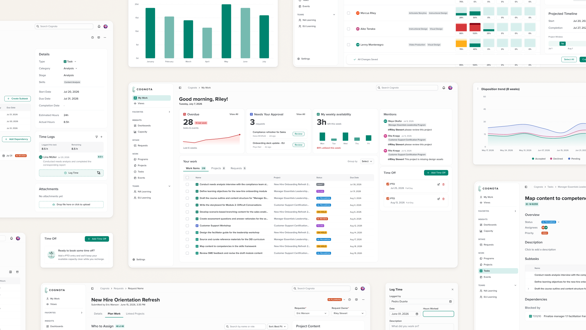
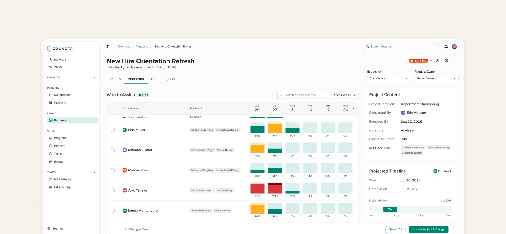
- Monochromatic, neutral backgrounds in both dark and light mode
- A single bright accent color — a green variant close to, but distinct from, our brand green — chosen to stand out clearly against the neutral backgrounds
- Lower contrast between surface elements, for a more subtle, polished feel
- Smaller icons sized to text height, for a more refined look
- A brighter, more saturated color palette, used on smaller surfaces, to add a touch of playfulness in line with our brand guidelines and contribute to a more modern look
- Enough whitespace to keep information-dense components breathable, paired with stronger typographic hierarchy to make dense pages easier to scan
- Rounder corners on large or container components, for a friendlier, more approachable feel
- Relocated page elements based on priority and frequency of use, so users could complete tasks with less back-and-forth
- Small moments of joy and playfulness — in copy (empty states, celebratory moments), and later in micro-interactions and subtle animation — to give the product character without sacrificing polish
The goal was a product people could adopt with confidence and enjoy using, not just one they had to use.
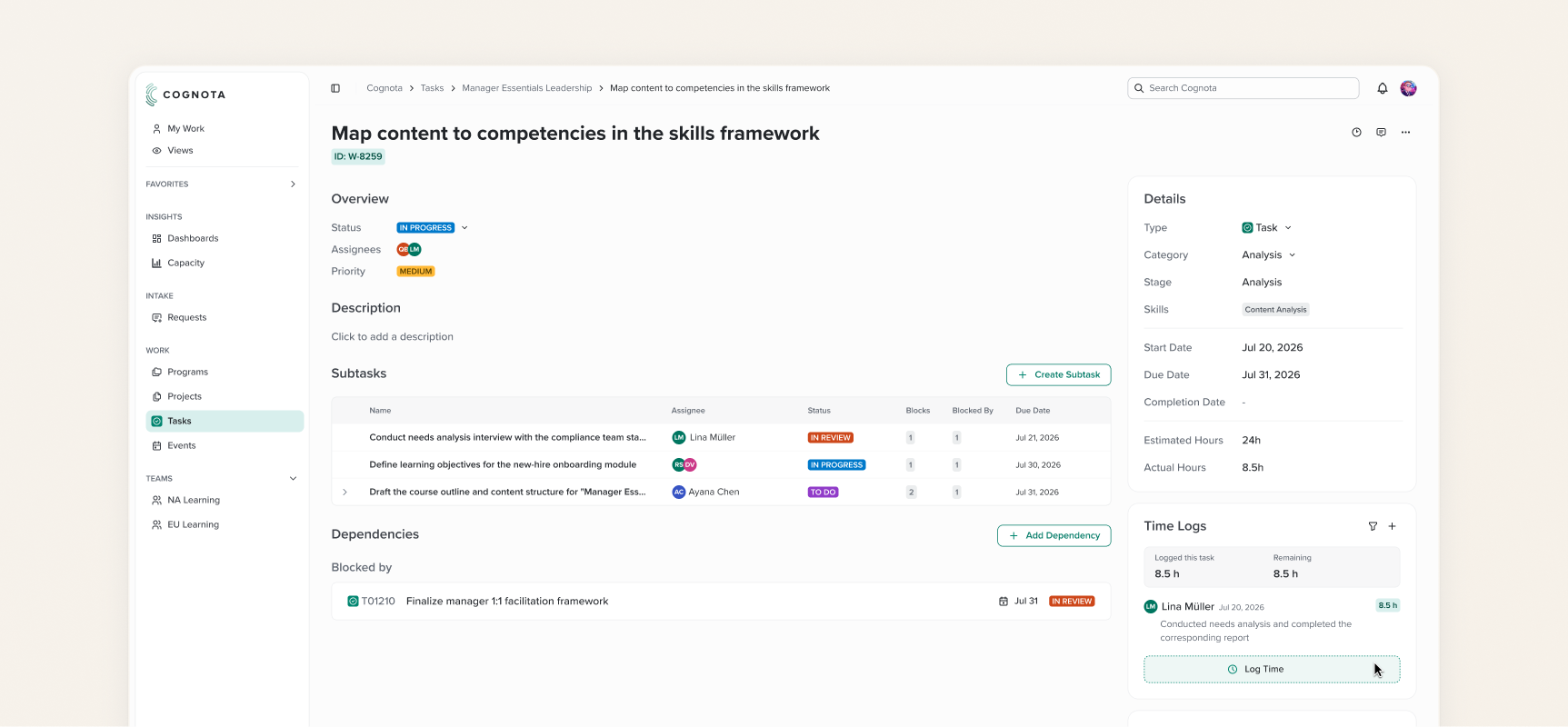
Key Decisions
Stepping away from the brand color palette. The existing product closely followed brand guidelines, which gave it a muted, dated feel. For the redesign of NextGen, we loosened those constraints and used brighter versions of our brand colors to create a more modern look.
Building on the existing design system. Rather than starting from scratch, we built on the AI-friendly design system already used for NextGen's first version, making it faster and more efficient to tokenize the new styles.
Designing for both light and dark themes. The original brief called for a light-theme focus, but with dark mode now standard in enterprise software, and already supported by our design system, I made sure the redesign worked in both. Dark mode was especially well received when I presented progress to the R&D team, reinforcing that the product needed to resonate with our own team, not just customers.
Outcome
By this stage, I had finalized the direction across color, layout, and typography and presented a set of high-fidelity mockups covering core sections in both light and dark mode. Cognota then went through a team restructuring that affected my role.
My next step would have been translating the new direction into the design system's token layer — updating color, spacing, radius, and typography tokens so the styling could propagate consistently across components rather than being applied ad hoc.
That work would have plugged directly into what our Design Engineer was already doing: unifying the platform's components with our design system in Storybook — laying the groundwork to support the new styling in a sweeping update — and prepping Claude Design for faster prototyping going forward.
As of August 2026, only some of the proposed styles have been applied to NextGen.
 Back to Main Page
